Since this journal post, we have stopped selling personalised cards. We continue to print packaging for our range of vintage lighting products using letterpress and personalise Moleskine and Leuchtturm notebooks using mechanical typesetting and letterpress.
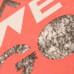
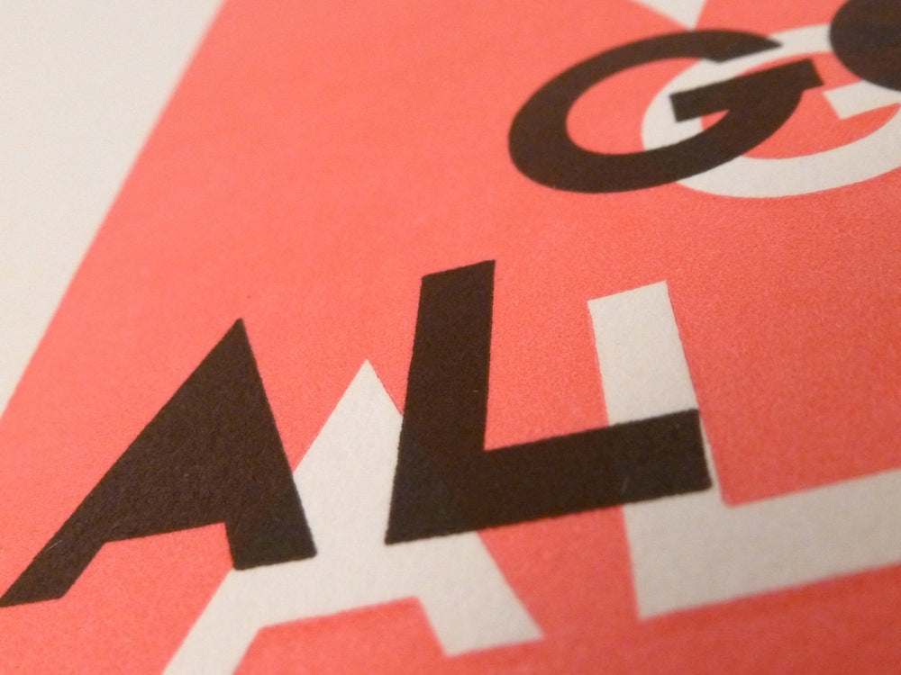
Original post: Peter Stitson's 'Making It Up As We Are Going Along' design for this card is a long way from the printing technicalities involved in producing it. Peter now runs a design practice in east London having been Dazed & Confused's art director for five years. Peter's card is available to personalise and buy here. The card features highly contrasting colours which need to be aligned. The areas of colour have to meet perfectly without overlapping. Printers use the term 'kiss fit' or the 'kiss register' for getting the ink to touch but not over-print the other colour.

 The high degree of accuracy required is only achievable with skill, experience and familiarity with the press used to print. To add a further layer of complexity, the design required the use of a strong fluorescent pink ink. It is difficult to get this ink to reproduce well on the uncoated organic cotton paper we use for our cards.
We think we've done well to hide the complexity of the printing processes behind Peter Stitson's simple, vibrant and eye-catching design.


Original post: Peter Stitson's 'Making It Up As We Are Going Along' design for this card is a long way from the printing technicalities involved in producing it. Peter now runs a design practice in east London having been Dazed & Confused's art director for five years. Peter's card is available to personalise and buy here. The card features highly contrasting colours which need to be aligned. The areas of colour have to meet perfectly without overlapping. Printers use the term 'kiss fit' or the 'kiss register' for getting the ink to touch but not over-print the other colour.


 The high degree of accuracy required is only achievable with skill, experience and familiarity with the press used to print. To add a further layer of complexity, the design required the use of a strong fluorescent pink ink. It is difficult to get this ink to reproduce well on the uncoated organic cotton paper we use for our cards.
We think we've done well to hide the complexity of the printing processes behind Peter Stitson's simple, vibrant and eye-catching design.


Leave a comment
This site is protected by hCaptcha and the hCaptcha Privacy Policy and Terms of Service apply.