Since this journal post, we've sold out of the first print run of gift vouchers. But we still have 'blanks' which can be foiled with the value of the voucher and a code. Get in touch for more information.
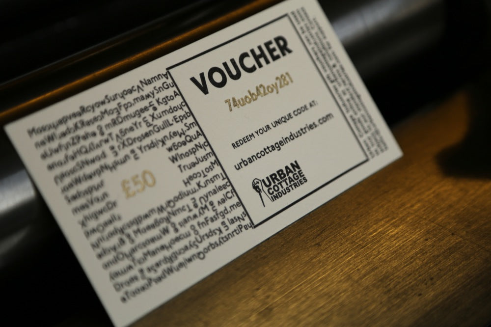
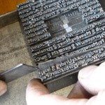
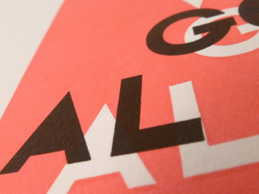
Original post: Our gift vouchers came off the presses yesterday and they are nothing less than compellingly beautiful. It is easy to forget that human existence in a world where words and images, moving and still, are completely ubiquitous is new. The volume of text and images, whether rendered on paper or on screen, is ever increasing and a number of trends can be discerned. There is an on-going arms race to achieve perfect digital reproduction whether that be pixels per inch and 'retina' displays or huge dpi figures in hard copy printing. There also seems to be a tendency to appeal to humanity's lower inclinations; there's a race to the bottom, sometimes in more than one sense of the word. If you want the antithesis to these digital trends, you need to see one of our gift vouchers. It's like coming up for air. The creation of the gift voucher started with one of our printers - Steve - composing by hand a block of random text in a mixture of Granby fonts. The Granby font was released by the renowned Sheffield type foundry Stephenson, Blake in 1930. Although Stephenson, Blake had an unrivalled reputation for type quality, it was the font faces of the mechanical composition companies - Linotype, Monotype and Harris-Intertype - which achieved dominance. It is more than arguable that Granby is a more balanced and attractive font than its commercially successful cousins such as Gill Sans. An open block is left in the middle of the hand-set Granby so the value of the voucher can be inserted. Rules are used to create a box for the word 'VOUCHER', set in Granby extra bold 36 point to complement the block of random text. We also insert our logo and information about the voucher. The forme containing these elements is bedded on one of our original Heidelberg platen presses from the middle of the last century and we print on 100% pure cotton acid free mould made paper from the UK's last manufacturer. The final process is the gold foiling of the value of the voucher and the unique code. The type used to create the code is made on one of our historic Linotype machines and the gold foil is applied using a hand press. It's hard not to be evangelical about the qualities of skilled analogue typography. We defy you to hold one of our gift vouchers and not be impressed by the combination of skill and artistry which have gone into making it. Traditional typography and printing is an unusual branch of the graphic arts; but we have no doubt that the combination of artistic creativity and mechanical engineering skills must be preserved. Urban Cottage Industries gift vouchers will be available online from 28 November 2013 and can be found here. We can accommodate all budgets with £25, £50, £100 and £250 denominations. When the recipient has spent the value of the voucher, they still have a completely original and beautiful example of artisanal typography and printing.
Original post: Our gift vouchers came off the presses yesterday and they are nothing less than compellingly beautiful. It is easy to forget that human existence in a world where words and images, moving and still, are completely ubiquitous is new. The volume of text and images, whether rendered on paper or on screen, is ever increasing and a number of trends can be discerned. There is an on-going arms race to achieve perfect digital reproduction whether that be pixels per inch and 'retina' displays or huge dpi figures in hard copy printing. There also seems to be a tendency to appeal to humanity's lower inclinations; there's a race to the bottom, sometimes in more than one sense of the word. If you want the antithesis to these digital trends, you need to see one of our gift vouchers. It's like coming up for air. The creation of the gift voucher started with one of our printers - Steve - composing by hand a block of random text in a mixture of Granby fonts. The Granby font was released by the renowned Sheffield type foundry Stephenson, Blake in 1930. Although Stephenson, Blake had an unrivalled reputation for type quality, it was the font faces of the mechanical composition companies - Linotype, Monotype and Harris-Intertype - which achieved dominance. It is more than arguable that Granby is a more balanced and attractive font than its commercially successful cousins such as Gill Sans. An open block is left in the middle of the hand-set Granby so the value of the voucher can be inserted. Rules are used to create a box for the word 'VOUCHER', set in Granby extra bold 36 point to complement the block of random text. We also insert our logo and information about the voucher. The forme containing these elements is bedded on one of our original Heidelberg platen presses from the middle of the last century and we print on 100% pure cotton acid free mould made paper from the UK's last manufacturer. The final process is the gold foiling of the value of the voucher and the unique code. The type used to create the code is made on one of our historic Linotype machines and the gold foil is applied using a hand press. It's hard not to be evangelical about the qualities of skilled analogue typography. We defy you to hold one of our gift vouchers and not be impressed by the combination of skill and artistry which have gone into making it. Traditional typography and printing is an unusual branch of the graphic arts; but we have no doubt that the combination of artistic creativity and mechanical engineering skills must be preserved. Urban Cottage Industries gift vouchers will be available online from 28 November 2013 and can be found here. We can accommodate all budgets with £25, £50, £100 and £250 denominations. When the recipient has spent the value of the voucher, they still have a completely original and beautiful example of artisanal typography and printing.







Leave a comment
This site is protected by hCaptcha and the hCaptcha Privacy Policy and Terms of Service apply.