Interior designer and architect Patrick Williams has offices in London and Bath and specialises in period properties. With more than 15 years of experience he’s built up a reputation for sympathetic, creative restorations and is on the shortlist for the next edition of House & Garden's 100 Leading Interior Designers. We spoke to Patrick recently with a view to getting some top dining room design advice.



 Click here to find out more about Patrick’s design practice and get some more dining room design inspiration. Or
Q. Describe your approach to interior design in three words.
A. Building is client.Q. What’s the most common mistake people make with dining room design?
A. Overcrowding a dining space with too many chairs round too large a table. I’m often asked by clients to base a design on Christmas Day requirements, when Grandpa and Great Aunt Gabrielle, plus half a dozen high chairs all need fitting in. This is one day in the year - let that be the day you have a fun, cramped, intimate family moment! For the remaining 364 days of the year, have a table that's the right size for the space and only as many chairs as are needed on a day-to-day basis. I always have the odd chair in a bedroom or bathroom that can be brought in for Great Aunt Gabrielle, and you can always improvise a table extension to suit.
Q. Open-plan kitchen dining space or separate dining room, which gets your vote?
A. I much prefer the modern "open-plan" kitchen diner scenario. Our kitchens are now our living rooms after all, and if you like to entertain it's so lovely to be able to cook and chat to your guests at the same time. What's more, as a guest, I rather like smelling what's cooking, or catching a glimpse of a crumble entering the oven as the main course is served.Q. What’s your dining room pick from UCI?
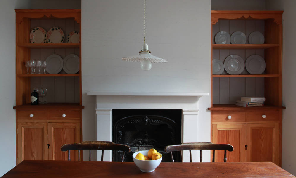
A. The Bletchley Park Glass Pendant Light. Reason being that it can provide a directed light when hung over the centre of a table whilst diffusing a soft glow of light around the rest of the room.Q. When it comes to dining rooms what would you splurge on and what would you save on?
A. I would spend on lighting. Really lovely glassware can make a huge difference too. Crockery can easily be picked up in charity shops and mixed and matched.
Q. What’s your pick for table wear?
A. We love the pottery from the Digoin stoneware factory in France. Like so many potteries, the company went bust, twice in fact, but was then bought up by Corinne Jourdain Gros - a student who was midway through writing her dissertation on the traditions of French manufacturing. She realised the factory couldn't make a profit creating packaging for foodstuffs anymore (although Maille mustard are still faithful clients), so she reinvented their stock.
Q. What mistakes do people make when lighting a dining room?
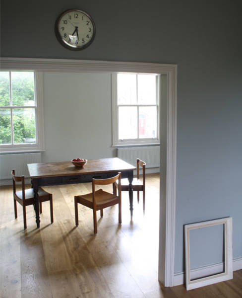
A. There is nothing worse than dining in too bright a space in the evening. But it's not only the quantity of the light; it's the direction and the tone of light. The ubiquitous recessed ceiling lights deliver light directly, from above which I find unnerving for some reason. I much prefer a dining room to be lit softly with peripheral standard lamps or table lamps on sideboards, and then for the middle of the table to be lit with a fairly direct beam of light, or by candles. Certain wall colours work better than others in this respect. Even light tones such as Fired Earth's Bone White, which is calm and fresh feeling in daylight, becomes a soft deep tone when dimly lit. You can't beat candles for atmosphere in the evening - an open fire likewise.
Q. Tell us about a dining room design that has absolutely blown your socks of.
A. The dining room at Philip Webb's Red House is a beautiful, serene space. The Red House, which is now owned by The National Trust, was Webb's fist commission as an architect, and was built for William Morris as his family home. Sadly I have not dined in it myself, so can only imagine what the experience would be like. Whilst it's a calm and bright space during the day with plenty of natural light, I imagine despite its size and light tones, that it would be an intimate, candle-lit space in the evening.Q. Any tricks for creating a family-friendly dining room design?
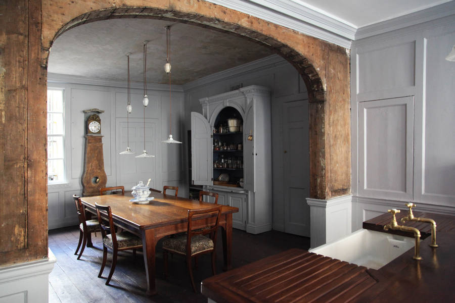
A. Often a dining table is also one's breakfast table, writing desk, kids' painting zone etc. A good solution to suit the needs of different family members is to use a rise and fall light. I grew up surrounded by the 19th century French Monte Et Baisse lighting which has a porcelain shade on a counter balance weight mechanism. The counter balance has a little cork plug at the top and you can fill it with lead shot to the desired weight so that it is in perfect balance with the shade and bulb, enabling you, like a sash window, to raise or lower the light. So when the kids are painting you can raise it up for a wider beam across the whole table, and when having an intimate super, it can be lowered to just above head height when seated, thereby giving a narrower beam direct on to the centre of the table. Click here to find out more about Patrick’s design practice and get some more dining room design inspiration. Or



Leave a comment
This site is protected by hCaptcha and the hCaptcha Privacy Policy and Terms of Service apply.